FROM THE CREW
Hey there 👋 – The Crew here!
Is it just us or did Winter zoom past faster than Max Verstappen?
Yes, obviously some of The Crew members are into F1…Are you?
Reading time: 4 minutes and 47 seconds, (unless you’re the Verstappen of reading).
New to Psychology of Marketing? Join us for free 🤝
SPONSORED BY HUBSPOT
How to make your content compete with chatbot responses

This year, it’s predicted that more and more people will use chatbots instead of search engines to find answers.
So, how can your content compete with AI’s tailored responses?
With personal experience.
By drawing on your personal experiences, you can wow potential customers with insights they didn’t know they needed.
This is just one tactic to navigate recent tech advancements. There’s much more you should know—and that’s where HubSpot’s 2024 State of Marketing report can help.
It unpacks the latest marketing shifts in 2024 and suggests actionable steps for refining your strategy.
PSYCHOLOGICAL EFFECT
Psychological Principles In Landing Pages
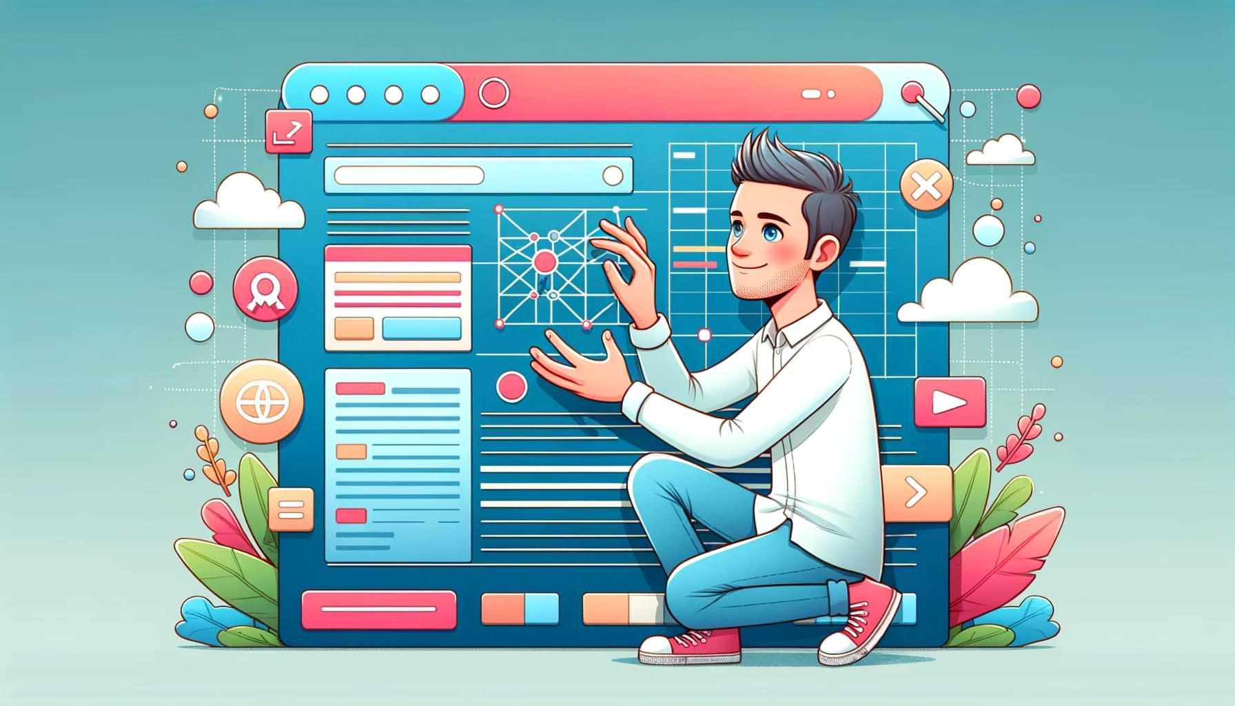
Today we’re going to steal a page from Russel Brunson’s book and do some funnel hacking. But we’re going to do it our way – the Psychology of Marketing way.
And we’re going to focus on a specific step of your funnel: Your landing pages.
What’s your conversion rate now?
Today’shis newsletterissue might will make it bigger.
Three examples of psychological principles applied to landing pages
#1 — Buttons and call to actions
When it comes to call-to-action buttons, there are two main pieces of advice you should follow. One is about attention and the other is about psychological framing.
- Make them stand out.
- Frame them as a gain.
First, your CTA buttons must draw attention, they must stand out.
And there are two main rules to follow here:
- White space around the button: Make sure there is plenty of white space around your CTA button so that it stands out above all other elements. The rule of thumb here is that in each section containing a CTA, the CTA should be the second element they notice right after the header of the section.
- Different color: The color of your CTA buttons should be different from every other color used on your landing page. Before you start building your landing page, define a color of the button and use that color just for your CTA.
Now point number two, framing the CTA as a gain a visitor gets. The text of your CTA should be about the gain they get, not what they’re separating from. For example, you shouldn’t have your newsletter CTA say “InsertGive me your email.”
Here are some examples:
- “Gain access to _____”
- “Start getting [outcome] now”
- “Get [product]”
- “Start getting [benefit]]”
#2 — One problem, one outcome, one call to action
The worst thing you can do to kill the conversion rate of your funnel is create confusion.
That is why everything on your landing page should be focused on solving one problem, promising one outcome, and asking visitors to take one action.
This is so simple. But it’s crazy how many businesses still mess this up and end up adding five different value propositions to their page, trying to address as many use cases as possible.
This creates confusion and stress. Cortisol levels will go up, and they’ll abandon the page. Will they ever be back?
#3 — Gain and keep attention
Beginner marketers think that they need to get attention once then the job is done. Advanced marketers know that attention is something you must get and retain high throughout the customer journey.
One way to do it throughout your landing page is through pattern interrupt.
See, our primal brain has been trained for millions of years to spot differences. Imagine a primitive hunter going to look for food. He needed to spot a snake in the woods. Or a different temperature that signals the arrival of a storm. Or he needs to spot the difference between edible berries and poisonous berries.
Do you remember the lady in the red dress from the Matrix movie? Why do you think Neo spotted her immediately?

She stands out.
This is something you should do on your landing pages as well.
Use different background colors for your sections. Add infographics, before/after images, graphics, and pictures in your landing page to break the pattern.
Different elements in your landing page “wake up” your prospects and keep their attention high, so they can consume your sales message and be led to purchase.
CLICKWORTHY
INFLUENCER MARKETING: Keep your ads fresh with a steady supply of licensed UGC, while getting extra organic reach from micro-influencers whose followers vibe with your brand. It’s super easy, too, because minisocial does the matching. Start your first campaign for 15% off.*
AI TRENDS: Overwhelmed by how fast AI is changing? The Deep View sifts through the noise and gets you up to speed on what matters in AI development. Join 160,000+ subscribers making the most of AI and sign up for free with one click.*
TIKTOK: The bill to ban TikTok has passed the House—now it’s up to the Senate to decide. When will that be, nobody knows. But what seemed an improbable rumor a year ago is now a few steps away from becoming a reality. For marketers, it’s business as usual.
MARKETING: Remember when the word “viral” meant something? It appears that the word doesn’t carry the same weight as it once did, as our perception of virality is starting to change. Good read.
SEO: The latest Google’s Core Update—released to deal with low-quality, AI-generated, spammy content—started its “purge” quite effectively with hundreds of websites apparently deindexed already. Hope you weren’t naughty…
*This is a sponsored post.
ICYMI, last time we looked at the Recency Bias.
The “funnel hacker” Crew